|
ABACUS' standard charts include line, bar, column, area, scatter, pie, curve, pareto, step, surface, radar, cube, doughnut, pyramid, contour and curve area charts. Once you have selected the type of chart you want, the rest of the process for viewing each of these charts is the same.
To view a standard chart of your architecture
1.Ensure you have open the ABACUS file containing your populated architecture, and that you have evaluated your architecture.
2.Select Insert | Chart or click the toolbar button. The Charts window will be displayed.
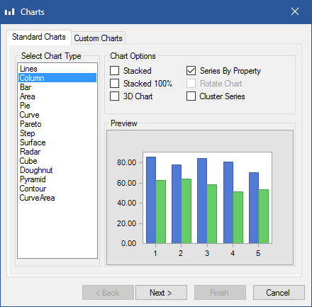
Charts window
3.Select the type of chart you want and set the Chart Options, then click Next.
Chart Options
oStacked will show the relationship of individual items to the whole. You can use a stacked chart when you plan to have multiple data series (i.e. multiple properties) and when you want to emphasise the total.
oStacked 100% will compare the percentage each value contributes to a total across categories. You can use a 100% stacked chart when you plan to have multiple data series (i.e. multiple properties) and you want to emphasise the contributions to the whole, especially if the total is the same for each element.
o3D Chart will simply display the data points in 3-D format for aesthetics. If you wish to display the data series along a 3rd / z-axis dimension then use the Cluster Series option described below.
oSeries by Property will display a data series for each property that is ultimately selected. If this is unchecked then the properties will become the categories and the data series will be for each element that is selected.
oRotate Chart will rotate the chart 90 degrees clockwise by interchanging the x and y axes. This option is only available for the Lines, Step and Cube charts and is particularly useful for making Milestone charts as described in the second tip below. Note: Column and Bar charts are already 'rotated' versions of each other.
oCluster Series will display multiple series data along a 3rd / z-axis dimension. This option is only available for the Column, Bar and Cube charts and is particularly useful for making Gantt style charts as described in the first Tip below.
 Tip Tip
You can create a Gantt chart with horizontal bars showing time/date properties for different elements by selecting a Bar chart type and then selecting the Cluster Series option. Furthermore, once created, the left-most bar on the chart can be made 'invisible' by colouring it white by right-clicking one of the bars, selecting Colour from the menu that appears and choosing the top-left colour from the palette. Additionally the border for the left-most bar can be made 'invisible' by right-clicking one of the bars, selecting Properties... and on the Series tab in the dialog that appears changing the Border Effect to None and Colour to the top-left colour from the palette.
Tip
You can create a Milestone chart with small shapes showing time/date properties for different elements by selecting a Cube chart type and then selecting the Rotate Chart and Cluster Series options. Furthermore, once created, the cubes can be changed to other shapes by right-clicking one of the cubes in a given data series and selecting Properties... and on the Series tab in the dialog that appears changing the Bar to either Cylinder or Cone. Note: The Gap width value can also be used to 'shrink' the symbols on the chart to reduce overlapping, the higher the number the less overlapping there will be.
4.In the Architectures section, tick the architecture/s you wish to chart the architecture level properties for, then click Next.
 Note Note
Selecting architecture level properties is an entirely optional step and should only be used when you want to explicitly chart the architecture level properties themselves. An architecture does not need to be selected to then include component or connection properties in the next step.
5.Select the Components and Connections that you want in the chart from the standard element selection window, then click Next.
6.Select the Properties you want in the chart and click Finish.
Chart Options
oInclude Standard properties will show the inherited properties from the Standards available for selection.
oAggregate Properties will count the variance between the series values and chart those results as opposed to the individual values themselves. This option is only available if the Series by Property option was selected in step 3 above.
Tip
The properties available for charting depend on the elements you select.
To save a chart
Note
Charts can only be saved if they only contain components and connections, all of which must be from a single architecture within the current project.
1.Ensure that you have a new or existing chart open and you have made the necessary changes.
2.In the chart toolbar click on the leftmost Save Chart button to save the chart and any formatting changes.
3.In the Chart Name dialog that appears enter a name for the chart and press OK.
To export a chart
1.Ensure you have an existing chart open.
2.In the chart toolbar click on the 2nd from left Save As BMP button and chose the location for the chart.
3.Click Save.

See Also
Analysing your architecture | Viewing a response time chart | Viewing a capability space chart
© 2001-2024 Avolution Pty Ltd, related entities and/or licensors. All rights reserved.
|